
Founder & CEO, Devot AI
A multi-domain Data Scientist and Software Engineer specializing in NLP, Large Language Models, and scalable AI systems. Aviral leads Devot AI with a focus on building production-ready solutions that solve complex business challenges.
When you hear developers talk about flutter widgets, they are talking about the day-to-day building blocks that decide whether a UI ships cleanly or spirals into refactors. This is the shortlist that keeps teams moving.
Executive Summary
This is a practical guide to the Top 10 Flutter Widgets Every Developer Must Know. It focuses on decisions you make under constraints, where each choice has a performance, complexity, or maintainability cost.
You will see where these widgets hold up in real builds, where they break, and how to avoid traps that create jank, bloated rebuilds, or brittle navigation.
Understand the trade space: layout control vs flexibility vs performance
Spot failure patterns early: nested scrolls, oversized build trees, async rebuild storms
Scale safely: structure lists, isolate state, and keep navigation deterministic
Introduction
You’re mid-sprint. A new screen lands late. Requirements shift. The design calls for a sticky header, dynamic lists, a subtle animation, and a gated flow. You can hack it together with anything, but you know some choices will cost the team later.
This is where a small set of flutter widgets do most of the heavy lifting. They turn last-minute asks into predictable outcomes. The Top 10 Flutter Widgets Every Developer Must Know isn’t a trophy list. It’s the gear you keep within reach when speed and stability both matter.
It’s trending because Flutter’s ecosystem keeps maturing while expectations rise. Apps are denser, data is noisy, teams are lean. Picking the right widget sooner saves hours of rework and prevents the kind of performance regressions that surface right before release.
How core widgets behave under real constraints
In production, widget choice is about controlling rebuilds, layout negotiation, and data flow. Most failures trace back to over-nesting, forgetting how constraints pass down, or coupling async work to wide build trees.
Concept map: choosing core widgets under pressure
Boundaries show up fast. Row and Column argue with unbounded constraints when they meet scrollables. Expanded can make a layout feel stable, but misused Flexible can hide overflow until content changes. ListView with naive children causes frame drops once data spikes. GestureDetector captures taps but can break defaults if it eclipses semantics.
Async builders feel convenient. FutureBuilder and StreamBuilder are great for one-off data hooks, but when they wrap entire subtrees, they rebuild more than intended. Navigator solves immediate routing, though unmanaged back stacks and ad hoc transitions make flows hard to test and reason about. These patterns repeat across teams, regardless of app domain.
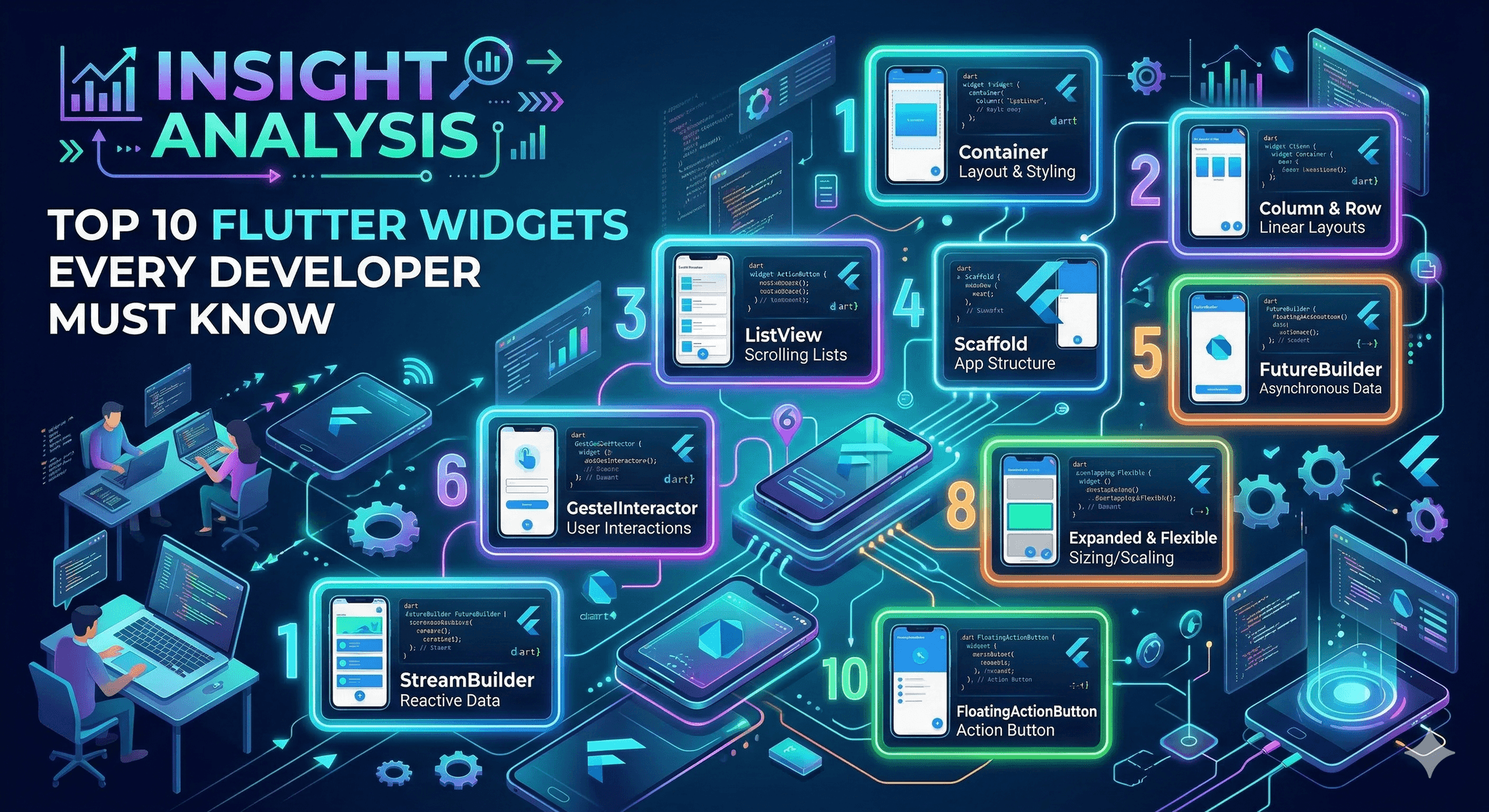
The 10 widgets you reach for under pressure
1. Container for quick composition
Good for padding, alignment, decoration, and short-lived layout tweaks. It’s a fast sketching tool that helps you get shape and spacing right. Consequence: too many Containers hide constraints. Prefer SizedBox or Padding when that’s all you need to reduce rebuild depth.
2. Row and Column for structure
These align content predictably, making flexible layouts readable. Consequence: nested Rows and Columns can balloon and fight with scrollables. Introduce spacing via SizedBox and apply mainAxis/ crossAxis settings intentionally to avoid surprise overflows.
3. Expanded and Flexible for proportional space
They distribute space without guessing sizes. Expanded locks a child to consume remaining space. Flexible yields control and respects content. Consequence: misuse leads to clipped content or infinite layout loops when combined with intrinsic sizing widgets.
4. Stack and Positioned for overlays
When you need badges, loaders, or guided hints, Stack places layers without wrecking layout. Consequence: extensive absolute positioning becomes brittle across screen sizes. Keep responsiveness by combining Positioned with MediaQuery or LayoutBuilder.
5. ListView for scrollable content
ListView.builder streams items efficiently for most feeds and menus. Consequence: item widgets that do heavy work in build cause jank. Cache small helpers, avoid expensive layouts inside items, and prefer const where possible.
6. GridView for dense visual grids
Quick to implement galleries or card collections. Consequence: naive grids look fine at small sizes but crush memory with large images or complex tiles. Use builders and lazy loading patterns, and be explicit about aspect ratios.
7. GestureDetector for interactions
Captures taps, drags, and long presses without ceremony. Consequence: it can mask default semantics and ripple effects. If you need material behavior, use InkWell in a Material context, or add semantics explicitly for accessibility.
8. LayoutBuilder and MediaQuery for adaptive layout
They make size-based decisions reliable. With LayoutBuilder, your widget reacts to its box, not just the screen. Consequence: respond to thresholds sparsely. Over-branching on size creates hard-to-test variations.
9. FutureBuilder and StreamBuilder for async UI
They bridge data to widgets cleanly. Great for one screen or a single component. Consequence: scattering builders everywhere fragments state. Keep them close to the minimal subtree that needs the data to cut rebuild blast radius.
10. Navigator for controlled flows
Whether you use simple push/pop or a declarative approach, Navigator anchors flow. Consequence: ad hoc navigation inside deep widgets breeds spaghetti. Centralize decisions; keep side effects out of build so the UI stays predictable.
Implementation that survives first release and scale
Start with layout skeletons. Sketch with Row, Column, and SizedBox until the hierarchy is clear. Lock proportions with Expanded only where necessary. Keep Container minimal and swap to more specific widgets once structure settles.
Introduce scrollables deliberately. Use ListView.builder or GridView.builder early and test with oversized mock data. If a list item stutters with placeholder content, it will break in production. Trim work from item build methods and move heavy lifting upstream.
Localize async. Wrap only the smallest widget that needs a FutureBuilder or StreamBuilder. If the entire page depends on data, structure the tree so loading and error states don’t force rebuilds of unrelated parts. This keeps frames smooth as data updates.
Plan navigation at the edges. Decide how routes are created, how parameters pass, and where guards live. A thin navigation layer yields clearer tests and fewer back-stack oddities. If deep links matter, make that behavior deterministic from day one.
At scale, watch for rebuild storms. Hot paths include scrollable item builders and fast-updating components. Introduce keys thoughtfully, prefer const constructors, and extract pure-presentational widgets to keep diffing simple.
Examples and applications that expose trade-offs
Data-heavy list with live updates
A feed renders thousands of items with intermittent updates. ListView.builder handles the volume, but item rebuilds spike when incoming data changes state high in the tree. Moving state closer to items and memoizing expensive subtrees cuts frame drops without rewriting the list.
Responsive detail screen with overlays
A product detail page needs an image gallery, dynamic specs, and a floating action panel. Stack keeps overlays simple. On small screens, Positioned values cause overlap. Adding LayoutBuilder gates the overlay layout at width thresholds and stops visual collisions.
Multi-step onboarding flow
Simple push/pop works for initial steps. A late requirement adds conditional branching and resume behavior. Left unmanaged, back behavior becomes inconsistent. Centralizing routes and using a clear source of truth for step state makes the flow testable and stable.
Where experience changes decisions
Topic Students/Beginners Experienced Practitioners Layout Stack Containers, then fix overflow Start with Row/Column, apply Expanded sparingly Scrolling Use ListView with full child lists Use builders, test with large fake data early Async Wrap whole pages in FutureBuilder Wrap minimal subtrees, isolate updates Interaction GestureDetector everywhere Prefer built-in semantics or InkWell when appropriate Navigation Push from deep widgets Route decisions at boundaries, keep flow predictable
Practical FAQ
When should I choose Expanded over Flexible?
Use Expanded when a child must take the remaining space. Choose Flexible when the child should share space but keep its natural size where possible.
Why is my list smooth on small data and janky on real data?
Builders hide cost until item count and complexity rise. Profile item builds, move heavy work outside build, and confirm recycling with keys.
Is it OK to nest ListView inside Column?
Only with bounded heights. Otherwise the list gets infinite constraints and throws. Wrap with Expanded or use layout that provides limits.
Where should I put FutureBuilder?
As deep as possible. Wrap just the part that depends on the async result to avoid unnecessary rebuilds elsewhere.
How do I keep navigation from getting messy?
Define routes and decisions near the app boundary. Avoid pushing from deep inside widgets. Keep side effects out of build methods.
Rising pressure to ship maintainable UIs
Teams are judged on iteration speed and stability at the same time. The right flutter widgets shrink the surface area of risk. The wrong ones multiply it.
As screens and flows become denser, the responsibility shifts toward choosing primitives that scale: smaller rebuild scopes, predictable layout, and navigation that holds under change. The trade-offs never disappear; they just move closer to day one.